
galaxy movement tab more user friendly
this is a simple drawing to express an ides=a i have put up before
it would give the option in expanded galaxy view to move to the next grid up or down instead of haveing to click on the move tab 5 times going left or right or 3 times going up or down
as i say this would make navigating the galaxy easier (of course it would make you no money so maybe this is why you ignore!)
16 Апреля 2017 16:06:29


great idea..
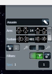
in this situation i just type the number instead of clicking because its less annoying and faster..
14, 17, 20, 23, 26
481, 486, 491, 496, 501
in this situation i just type the number instead of clicking because its less annoying and faster..
14, 17, 20, 23, 26
481, 486, 491, 496, 501
19 Апреля 2017 14:58:20

Try use "interactive galaxy", they should be better.
19 Апреля 2017 15:24:38
even in interactive the tab only moves one left or right
the idea is if you are serching the galaxy for ark, pirate or just attack, it would be easier to serch
the idea is if you are serching the galaxy for ark, pirate or just attack, it would be easier to serch
19 Апреля 2017 16:23:52
shane, Try to push map with mouse. in interactive view of course. works great.
Also doesn't change my mind.
Also doesn't change my mind.
19 Апреля 2017 19:25:35
i'm not talking about the map
i'm talking of how far you can move when serching the galaxy
how does no body see what a good idea this is?
i'm talking of how far you can move when serching the galaxy
how does no body see what a good idea this is?
20 Апреля 2017 10:00:47
This is a good idea and many players have already created similar topics, but we plan to completely abandon the old versions of the galaxy in favor of "interactive".
20 Апреля 2017 10:18:52
standard view is easier to see, easier to navigate.
do not like interactive. zzzz its a disorganized cluster to look at.
do not like interactive. zzzz its a disorganized cluster to look at.
21 Апреля 2017 16:37:35
for organised cluster we can use spiral sorting option in interactive view ... but interactive view takes too much memory.
don't abandon the old view...admin should keep both views...users can choose whichever options they like
don't abandon the old view...admin should keep both views...users can choose whichever options they like
21 Апреля 2017 16:57:51
as you add new features..doesnt mean you should phase out old ones.. thats just stupid.
if people like this one, and give a small improvement idea (ie move up 3, move right 5 arrow) and its been brought up many times.... why not just do what the players want instead of building some other monstrous view and then saying you're phasing out this one when the only thing they asked for was +3 and +5 movement...lol.. you guys amaze me..
if people like this one, and give a small improvement idea (ie move up 3, move right 5 arrow) and its been brought up many times.... why not just do what the players want instead of building some other monstrous view and then saying you're phasing out this one when the only thing they asked for was +3 and +5 movement...lol.. you guys amaze me..
22 Апреля 2017 13:17:46
if others (players) have suggested this why not do it as it is the players that play the game?
29 Апреля 2017 14:03:10
Информация
Вы не авторизованы
1 чел. читают эту тему (гостей: 1)
Пользователей: 0 Claude Bot